Family Photo Color Schemes: 10 Outfit Ideas That Photograph Beautifully
September 25, 2024

Figuring out what everyone should wear for your family session is one of the most common things I hear from families before their shoot. There’s no dress code, no formula, and somehow you’re supposed to make a toddler, a teenager, and two adults all look like they belong together. That’s exactly why I put this guide together.
As a Northern California family photographer serving Sacramento, Yuba City, Roseville, and Folsom, I’ve photographed hundreds of families – and I’ve seen firsthand which color combinations light up a gallery and which ones fall flat. Below are 10 of my favorite family photo color schemes, organized by vibe, season, and location type.
Whether you’re planning a fall session in the golden hills or a spring shoot by the river, there’s a palette here for you.
Warm & earthy color schemes (best for fall)
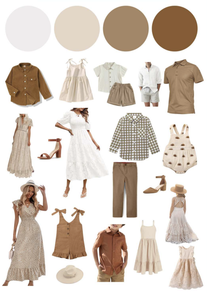
1. Cozy Neutrals– soft beige, cream, warm taupe
The most universally flattering family palette. Creams, warm whites, and taupes photograph beautifully in natural light because they don’t compete with the scenery – they complement it. This palette works in every season but truly shines in fall when the leaves turn golden.
Best for: outdoor sessions, golden hour, wooded locations, families who want timeless over trendy
What to avoid: mixing cool-toned whites (bright white, ice white) with warm creams – they clash in photos even when they look similar in person
Tip: Anchor the palette with one person in a warm caramel or tan, then let everyone else build around that.
2. Spice Cabinet Chic – mustard, burnt orange, cinnamon
This is the palette that was made for fall in Northern California. Rich mustard, pumpkin, and spice tones echo the season and look incredible in dappled light under oak trees. It’s bold enough to feel intentional but warm enough to feel cozy.
Best for: fall sessions, Folsom, Auburn, El Dorado Hills, outdoor golden-hour shoots
What to avoid: having every single person in orange — vary the depth. One person in burnt orange, one in mustard, one in rust, one in cream or tan.

3. Earthy Elegance – gray, taupe, tan, black
A slightly cooler take on neutrals. This palette reads polished and editorial, especially for families who lean toward a clean, minimalist aesthetic. The mix of warm and cool tones means it works year-round.
Best for: urban shoots, mixed indoor/outdoor sessions, families who prefer a more sophisticated look.

Cool & classic color schemes (works year-round)
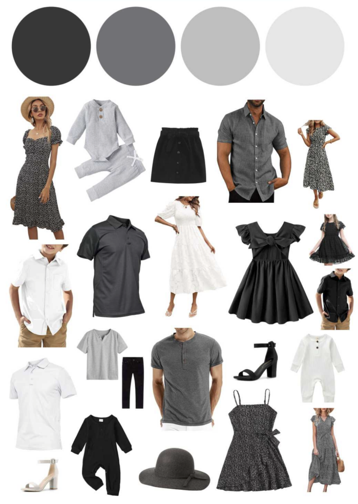
4. Classic Cool – black, white, gray
The most timeless palette in portrait photography. It never dates, it never clashes, and it prints beautifully. If you want artwork you’ll hang for 20 years, black and white is the move.
Best for: any season, studio sessions, architectural or urban backdrops, families wanting heirloom artwork
Tip: Add texture to keep it from feeling flat. Chunky knit sweaters, linen blazers, and layered scarves all read beautifully in this palette.
5. Navy & Cream – deep navy, soft white, khaki
One of the most requested palettes for a reason. Navy grounds the palette while cream keeps it light and airy. Add khaki or tan for a third neutral and you have a combination that works from spring through fall.
Best for: all seasons, river or waterfront locations, families with kids who look great in navy
6. Denim & White – light denim, white, natural
Relaxed, effortless, and casual. This palette photographs beautifully at the beach, in flower fields, or in open meadows. It has a lifestyle feel that reads less “posed portrait” and more “real family.”Best for: spring and summer, wildflower fields, Sacramento Delta, Davis, open grasslands.
Colorful & vibrant schemes (for families who love color)
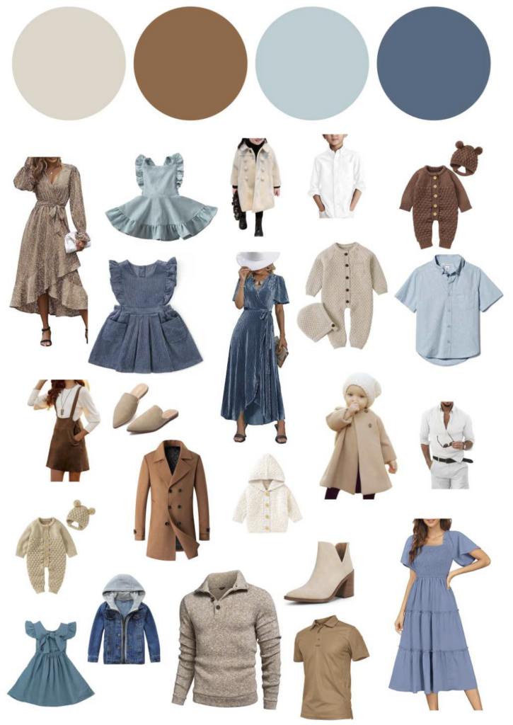
7. Autumn Skies – brown, cream, light blue, teal
One of my personal favorites. The combination of warm browns and cool blues creates a naturally balanced palette that looks stunning against fall foliage or open sky. It’s unexpected but incredibly cohesive in photos.
Best for: fall sessions near water, Feather River, Bidwell Park, open sky backdrops
8. Sage & Rust – sage green, terracotta, warm white
This palette has been everywhere the last few years for good reason. Sage and rust complement each other perfectly and both work beautifully in Northern California’s landscape. The earthy, organic feel photographs especially well in open fields and orchards.
Best for: fall and spring, outdoor sessions, families who want something a little different than the standard neutral palette
9. Dusty Rose & Mauve- blush, dusty rose, mocha, taupe
Soft, romantic, and feminine without being overly pink. This palette works beautifully for families with girls but it’s versatile enough to include dads and brothers without anyone looking out of place. A mocha or tan anchors the lighter pinks.
Best for: spring, garden sessions, maternity-to-newborn family sessions, feminine aesthetics
10. Deep Forest – hunter green, burgundy, cream, cognac
Rich, saturated, and dramatic. This palette photographs beautifully in the fall when the trees turn and the light goes golden. The deep tones add depth to your gallery images and translate especially well to large-format wall art.
Best for: fall sessions, wooded locations, Chico, Auburn, clients who want dramatic heirloom artwork
General outfit tips from your photographer
1. Start with one person, build around them.
Usually the hardest person to dress (toddlers, teenage boys) sets the palette. Once you have them sorted, everyone else builds around that anchor.
2. Coordinate, don’t match.
Matching outfits can look stiff. Instead, pull from the same palette – different pieces, similar tones. Think of it like decorating a room: not everything is the same color, but it all belongs together.
3. Avoid busy patterns.
Large plaids, bold stripes, and graphic prints compete with faces in photos. Solid colors and subtle textures almost always photograph better.
4. Layer for fall sessions.
Cozy scarves, cardigans, and light jackets add depth and texture to fall photos. They also give you options – layered for some shots, without for others.
5. Think about the location.
Cool-toned palettes (navy, gray, white) work well in urban or architectural settings. Warm palettes (earth tones, spice tones) shine in natural outdoor locations. If you’re unsure, ask your photographer – that’s what I’m here for.
Frequently asked questions about family photo color schemes
Q: What are the best colors to wear for family photos?
A: The most universally flattering family photo colors are warm neutrals like cream, taupe, tan, and caramel. These work in every season and location because they complement natural light rather than compete with it. For a more colorful look, deep earth tones like rust, mustard, and sage green photograph beautifully outdoors.
Q: Should everyone in my family wear the same color for photos?
A: No – matching outfits often look stiff and dated in photos. The better approach is to coordinate within a palette. Choose 3–4 colors that work together and let each family member wear something different within that palette. This creates a cohesive, natural look without feeling uniform.
Q: What colors should you avoid wearing for family photos?
A: Avoid neon colors, large busy patterns (bold plaids, graphic prints), and mixing cool whites with warm creams – they clash in photos even when they look similar in person. Very bright colors can also create color casts on skin in outdoor light.
Q: What colors are best for fall family photos specifically?
A: For fall family photos, warm earth tones work best – think burnt orange, mustard, cinnamon, rust, caramel, and deep burgundy. These colors echo the season and look stunning in dappled golden light. Neutral palettes in cream and taupe also work beautifully in fall because they let the colorful foliage be the backdrop.
Q: Can I include my newborn or infant in family photo color planning?
A: Absolutely. For sessions that include a newborn or very young baby, I recommend keeping the palette soft and warm – creams, blush, sage, and light earth tones. These colors photograph beautifully with newborns and tend to be more comfortable for parents to wear during the session too.
Q: Do you help clients plan outfits before their session?
A: Yes – outfit planning is a core part of every session at Megan Escheman Photography. I offer an outfit-selection program with photographer-approved looks, and I’m happy to pull specific links for you to shop. You’ll never have to figure it out alone.
Ready to plan your family session?
If you’re in the Sacramento area – including Yuba City, Roseville, Folsom, Elk Grove, or Chico – I’d love to create something beautiful with your family. Every session starts with a planning consultation where we’ll talk through your location, outfits, and what matters most to you about these photos.
Sessions are booking 6–8 weeks in advance for fall, so the earlier you reach out, the more flexibility you’ll have with dates and locations.
→ Click here to inquire about your family session
About Megan Escheman
Megan Escheman is a luxury portrait photographer based in Yuba City, California, serving families across the Greater Sacramento area and Northern California. She specializes in newborn, maternity, family, cake smash, and senior portrait photography with a focus on creating heirloom artwork families will cherish for generations.
Some Fan Favorites

Contact Megan
I photograph every portrait session personally.
I provide you with the individual attention that you and your family need to create a timeless masterpiece to cherish forever. You will not feel rushed, or pushed through a “system.” I treat every client like they are my family. Each portrait experience is customized and planned just for you! I’m just an email, phone call, or text message away, answering questions and giving suggestions along the way.
Click the button below to reach out to your Yuba City Photographer.
I'd love to meet you!
When you walk away from our session I want you to feel like you just made a new friend, someone who you can trust to capture and create memories that will last a lifetime!